
Creating a logo and brand identity for a baby product requires careful planning, creativity, and collaboration. For “Lätzchen Welt,” a brand focused on handmade baby bibs and accessories, the journey from concept to final logo was an insightful process. Here’s a detailed account of the steps involved, highlighting the key decisions made by the graphic designer, Amin, and the project manager, Timo.
Initial Concept and Brainstorming
The first step was to understand the brand’s identity and its target audience. “Lätzchen Welt” aims to deliver high-quality, handmade baby products, so the logo needed to reflect these attributes.
Key considerations included:
- Audience: Parents of babies and toddlers.
- Brand Values: Quality, craftsmanship, and a playful yet professional aesthetic.
- Visual Style: Soft, friendly, and appealing to both parents and children.
Sketching and Ideation
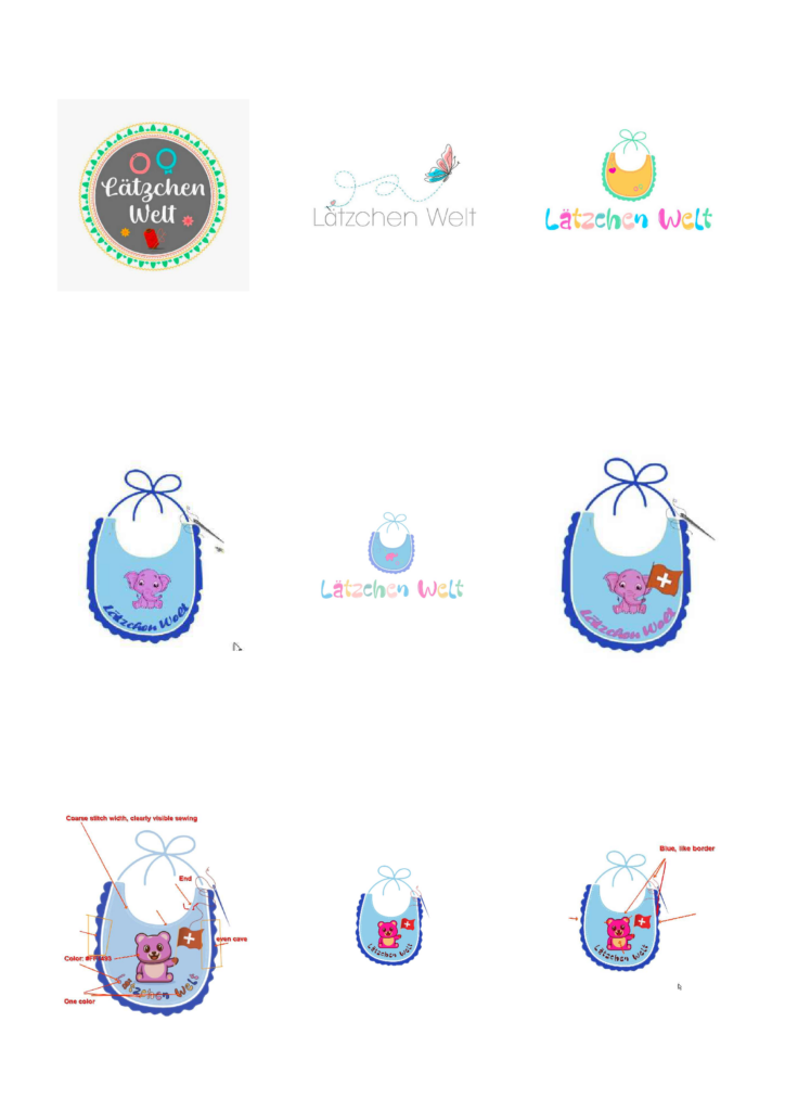
With these considerations in mind, several initial sketches were created. Amin, the graphic designer, explored different themes and elements that could represent the brand. Key themes included:
- Baby-related imagery: Bibs, toys, and cute animals.
- Soft colors: Pastel shades that evoke a gentle and nurturing feel.
- Handmade touch: Elements that suggest meticulous craftsmanship.
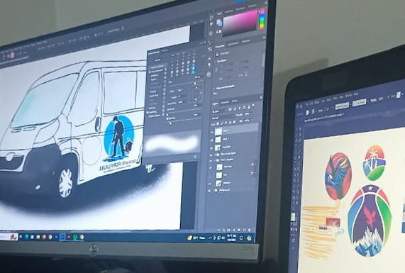
Digital Mockups and Variations
The next stage involved converting the sketches into digital mockups using graphic design software. This stage included experimenting with:
- Typography: Selecting fonts that convey a playful yet professional tone.
- Color palettes: Testing various combinations to find the most soothing and appealing colors.
- Iconography: Integrating symbols such as bibs, bears, and Swiss flags.
As the process evolved, it became clear that fewer colors made the design look more professional. Additionally, incorporating the Swiss flag helped symbolize quality and style, reinforcing the product’s Swiss origin.
In the attached collage, various logo iterations are shown, including designs featuring an elephant and a butterfly. While these designs were cute, the bear was ultimately chosen for its strong association with Switzerland.
Feedback and Iteration
Gathering feedback was a crucial part of the process. Timo and Amin collected input from team members and potential customers, focusing on:
- Clarity: Ensuring the logo is easily recognizable at different sizes.
- Relevance: Making sure the imagery directly relates to baby products.
- Aesthetics: Balancing cuteness with professionalism.
Based on the feedback, further iterations were made. The bear holding the Swiss flag was refined to make the logo distinctive and memorable.
Finalization
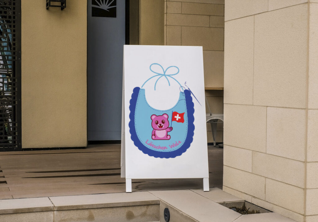
The final design was chosen for its balance of playfulness, clarity, and relevance to the brand. The logo features a friendly bear holding a Swiss flag, with the brand name “Lätzchen Welt” in a playful font. The color palette of soft blues and purples evokes a sense of calm and reliability.
![]()
Brand Application
Once finalized, the logo was applied across various brand materials to ensure consistency. This included:
- Website: Integrating the logo into the website design.
- Packaging: Designing labels and packaging with the new logo.
- Marketing materials: Creating business cards, brochures, and social media graphics.
The final logo successfully communicates the essence of “Lätzchen Welt” and provides a strong visual identity that is both recognizable and trustworthy.
Mehr Artikel: Icon Design